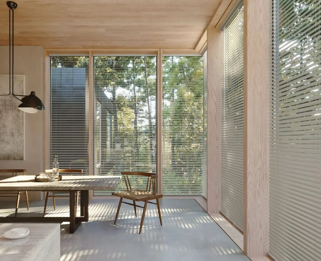
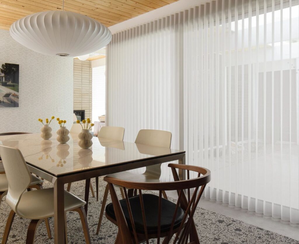
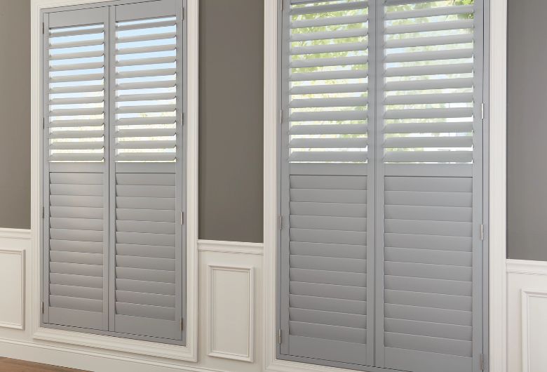
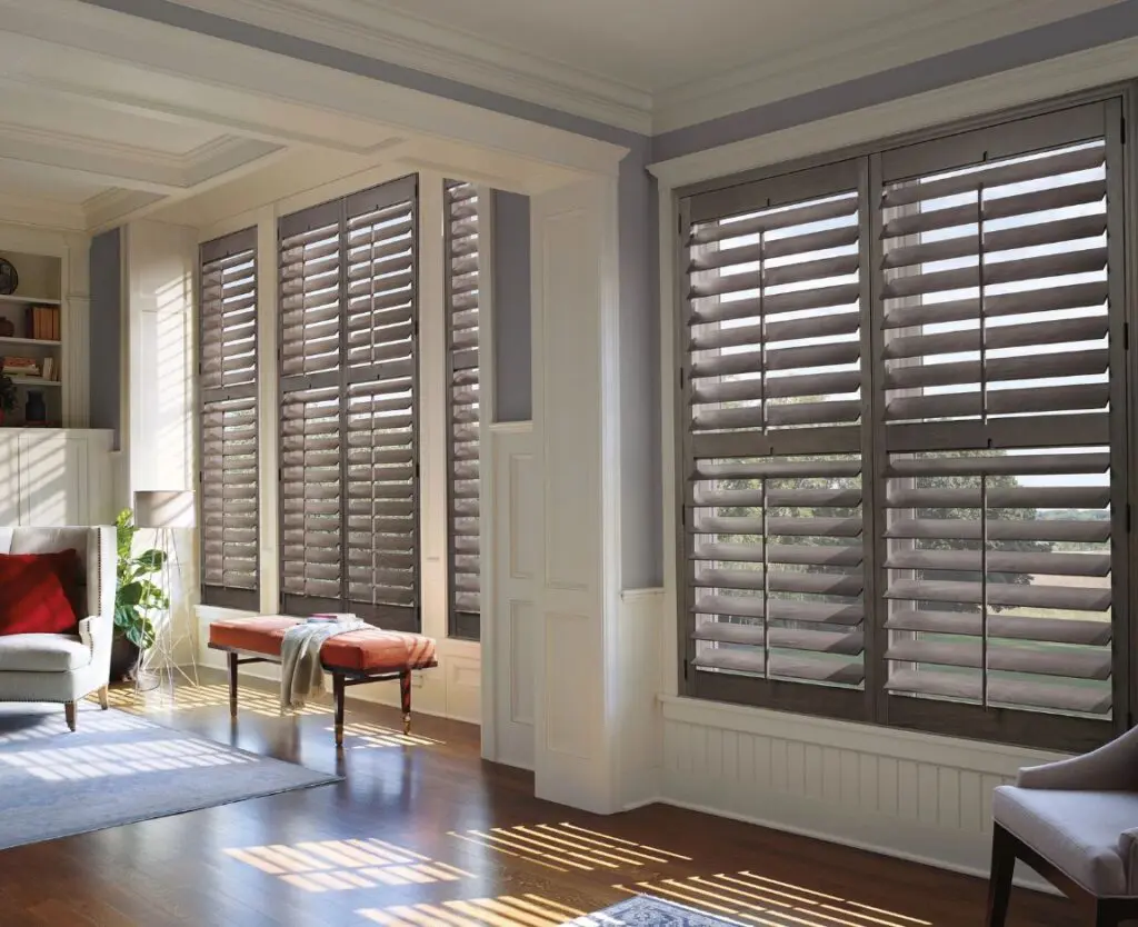
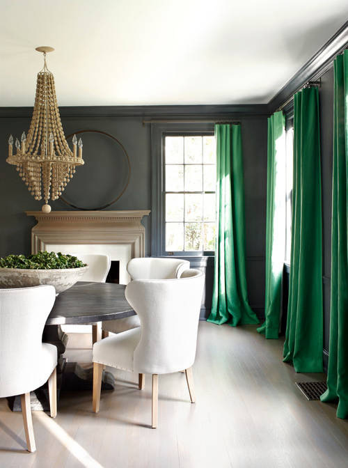
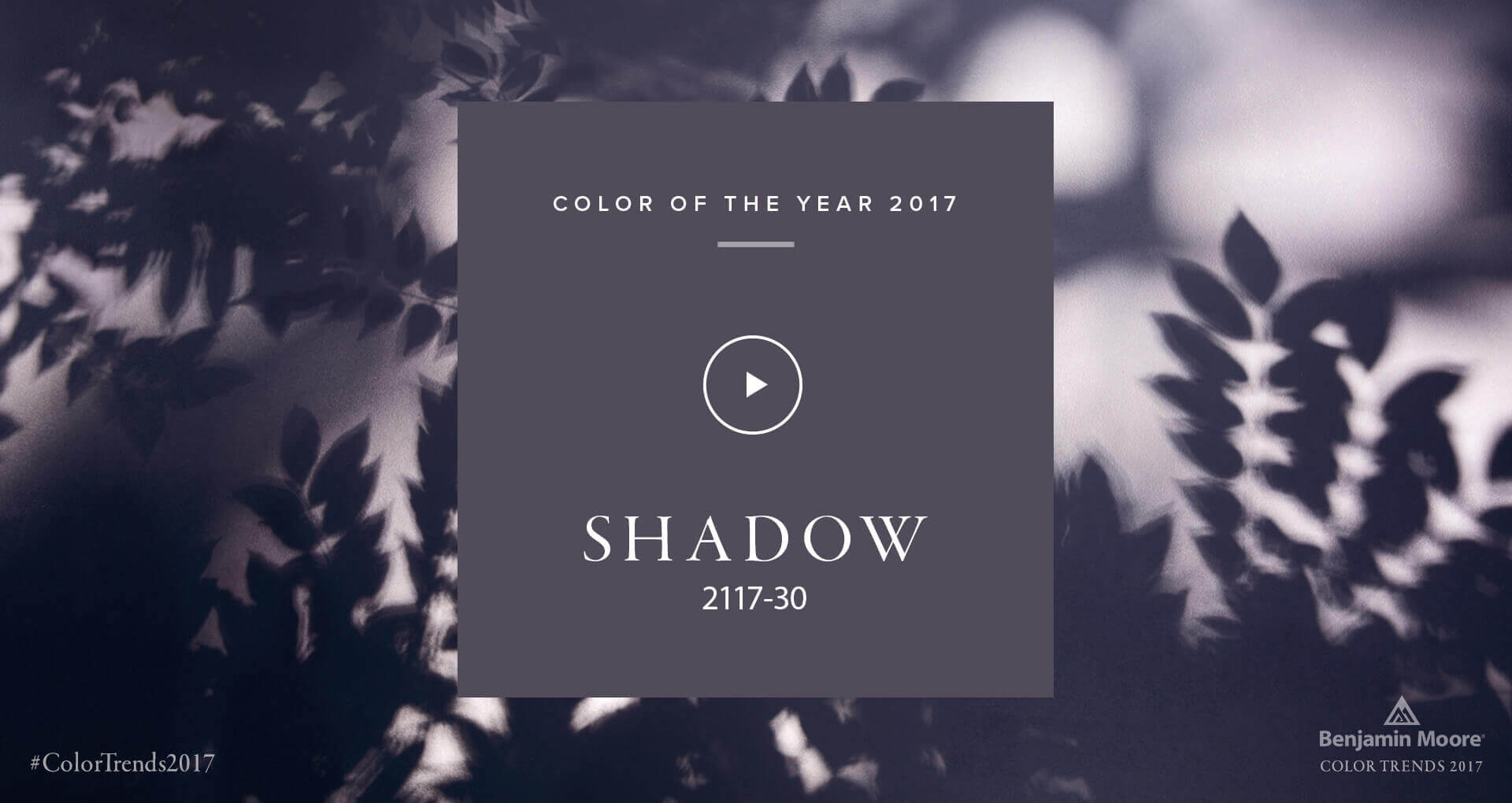
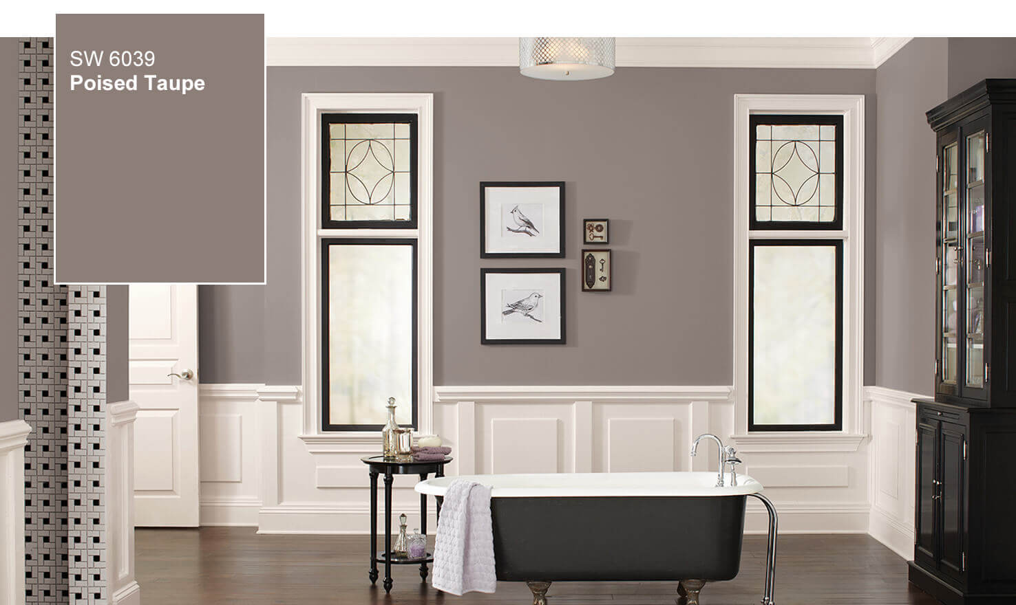
Each year, industry influencers choose colors that help shape the design world. Pantone® recently revealed Greenery 15-0343 as their Color of the Year for 2017, stating that it’s “nature’s neutral.” Benjamin Moore’s Color of 2017 is Shadow 2117-30, which they describe as a “rich, royal amethyst that fades into a soft lilac-grey.” And Sherwin-Williams declared Poised Taupe 6039, a deep greige color, as their choice for the year.

It’s always fun and exciting to see which colors are going to be chosen. Have you ever wondered who’s behind these choices and how they make their selections?
We sat down with designer Janice Pattee, who is a member and chairholder of the Color Marketing Group (CMG), to get the inside scoop. CMG is a not-for-profit international association of color design professionals involved in the use of color as it applies to the profitable marketing of goods and services. CMG provides a forum for the exchange of non-competitive information relating to all phases of color marketing: color trends and combinations, design influences, merchandising and sales, and education and industry contacts. Members interpret, create, forecast, and select colors in order to enhance the function, salability, and quality of manufactured goods.
Q1: Thanks for speaking with us today, Janice. We are excited to talk with you about color! What can you tell us about how color trends and colors of the year are selected?
The Color Marketing Group members are designers, marketers, color scientists, consultants, educators, and artists. We derive powerful color and trend information through member interaction at our workshops and conferences.The members of Color Marketing Group convene throughout the year, in local and international gatherings, to discern what innovations are about to change the world, what adaptations we need to make, and which hues best express how colors evolve with the times. From discussions ranging from social change to social media, from technology to nature, from keynote speeches to firsthand workshops, trends emerge. Consensus is reached. And the palette of the future takes shape.
When it comes to each individual company, they have their own forecasting and trend tracking process. Many of the designers and forecasters are members of CMG and therefore use the information from our Summit meetings as validation and inspiration for their own color palettes. For example; at the 2015 CMG International Summit, in the workshops, there was great discussion regarding the color green. As a result, A fresh green, influenced by yellow and that symbolizes a balance, energized future emerged. A color that is a symbol for growth, strength, endurance, newness and wellbeing. “Thrive” was a green that CMG introduced for 2017. Recently, Pantone introduced “Greenery” a fresh and zesty yellow-green shade as their color of the year for 2017.
Q2: Which color trends do you predict will be popular internationally in 2017?
Nature inspired neutrals with green is one color to watch.
Q3: Can you give us your list of design trends that you think will gain momentum in 2017?
- Simple design with combinations of texture and pattern and color.
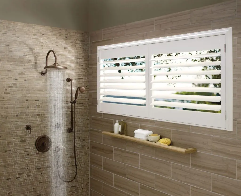
- Warm metallic finishes, in particular warm copper.
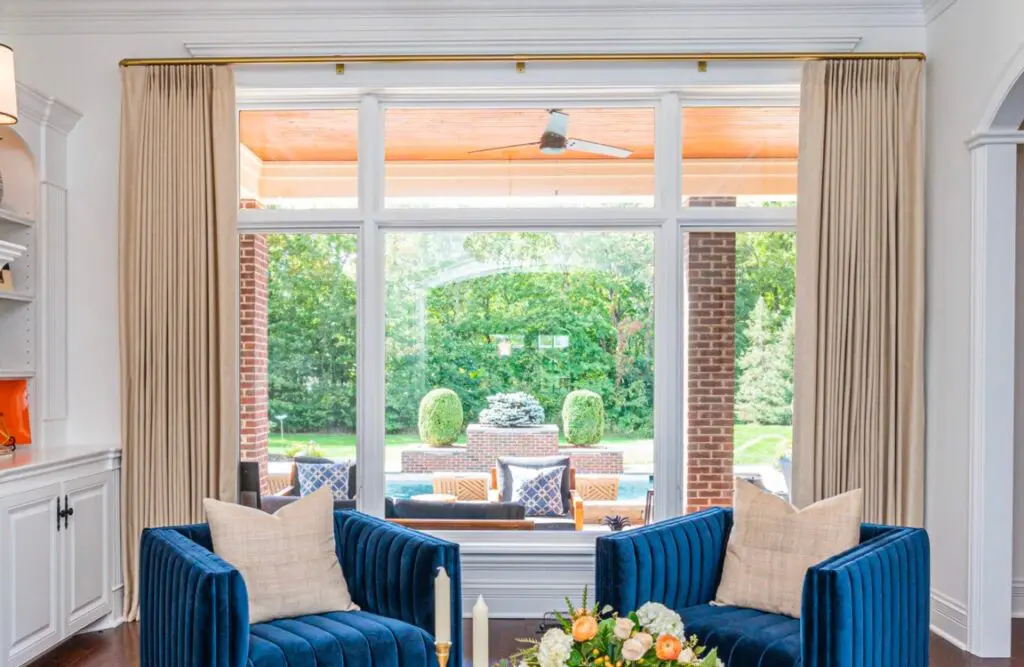
- Matte gold finishes and warmer, softer metal colors.
- Layers of color and pattern.
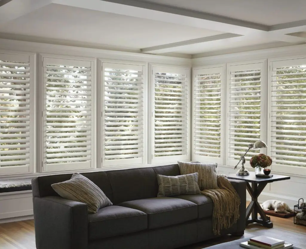
- Grey and white or staple neutrals combined with pops of soft color.
- Pattern on pattern — mixing the scale of the same pattern.
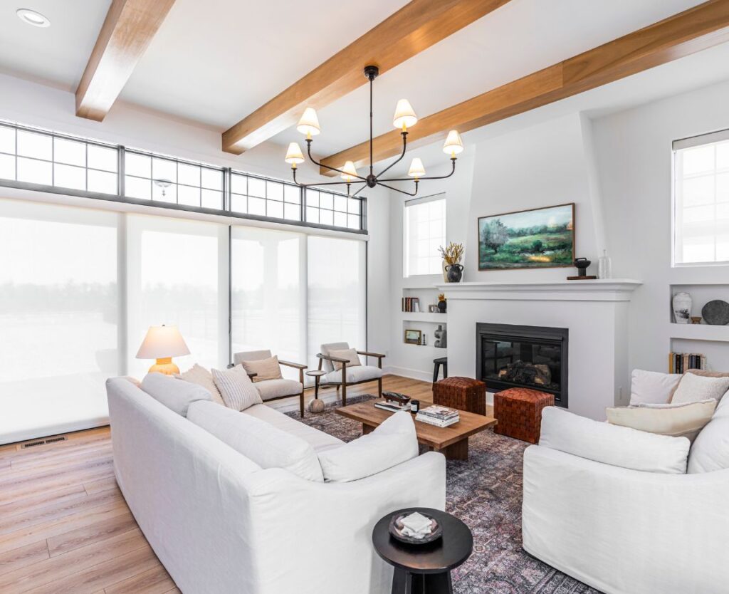
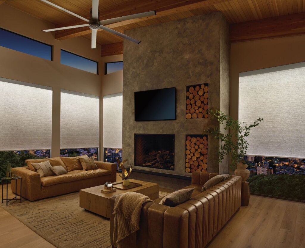
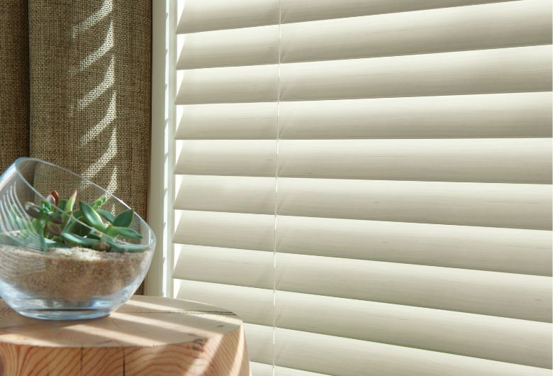
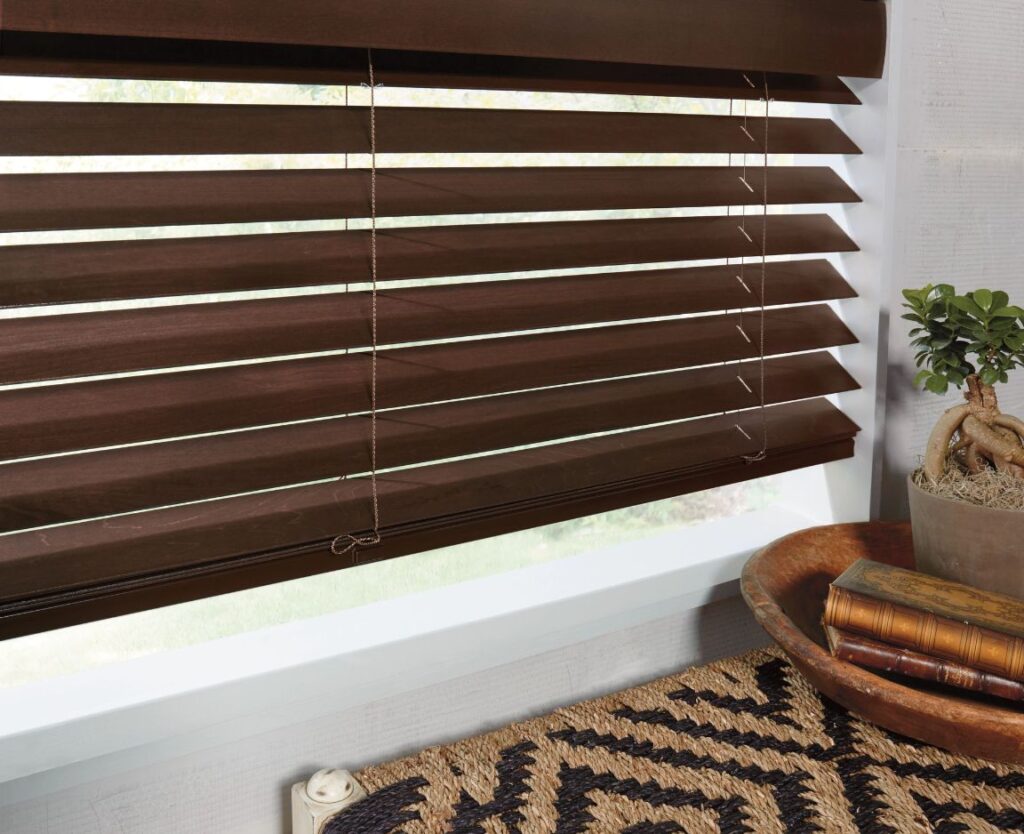
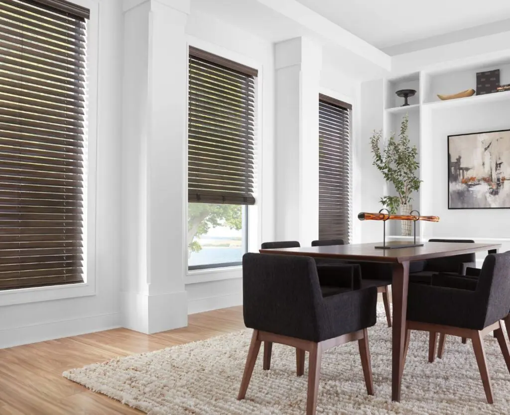
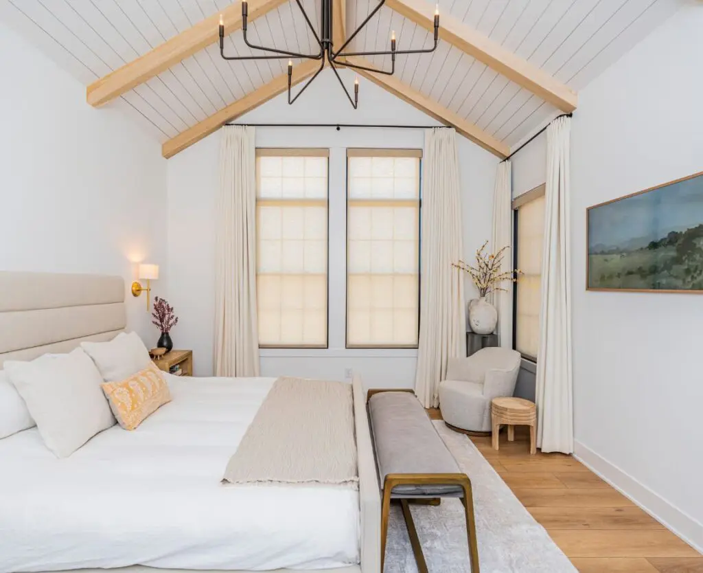
- Warm neutrals, natural woods, lighter woods with a tighter grain, taupes and camel colors.
Do you have any color or design predictions for 2017? We’d love to hear them! Let us know in the comments below. Then be sure to check out Janice’s work on her website.
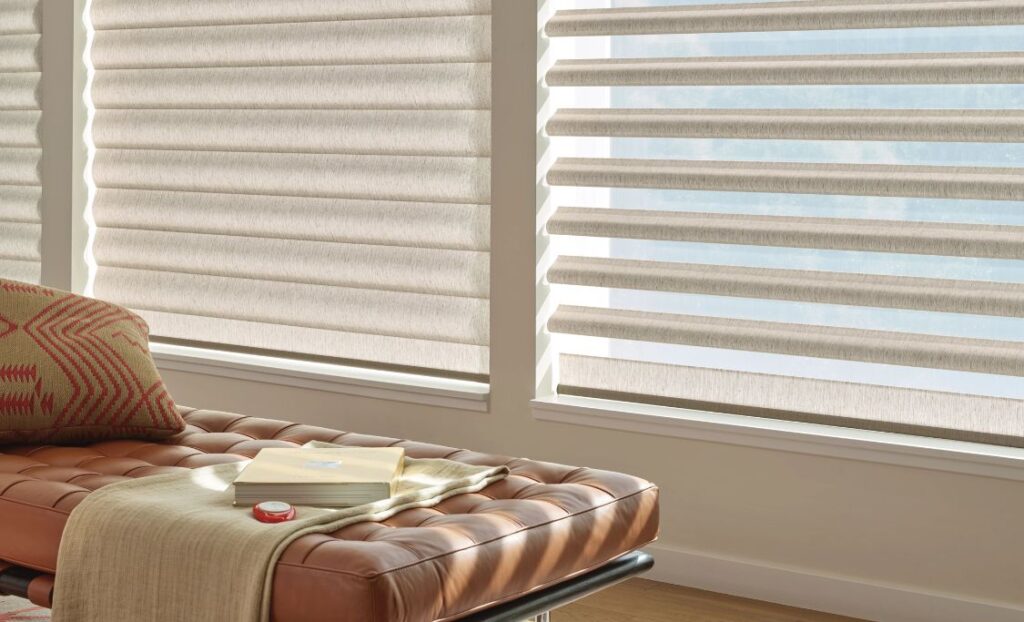
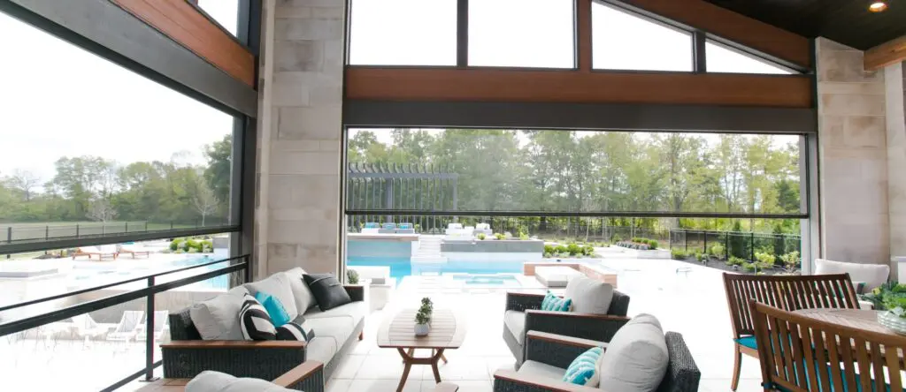
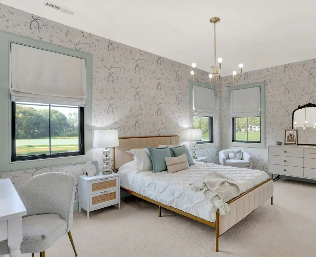
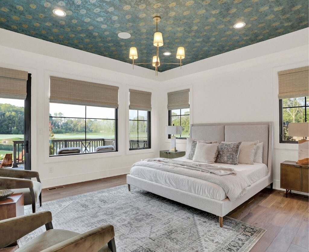
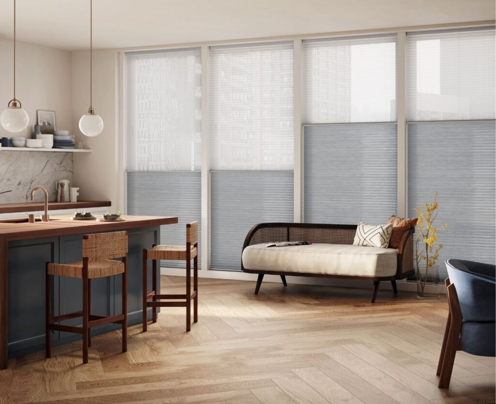
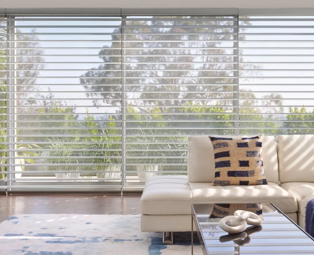
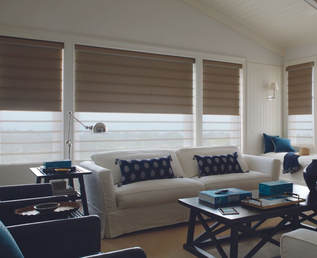
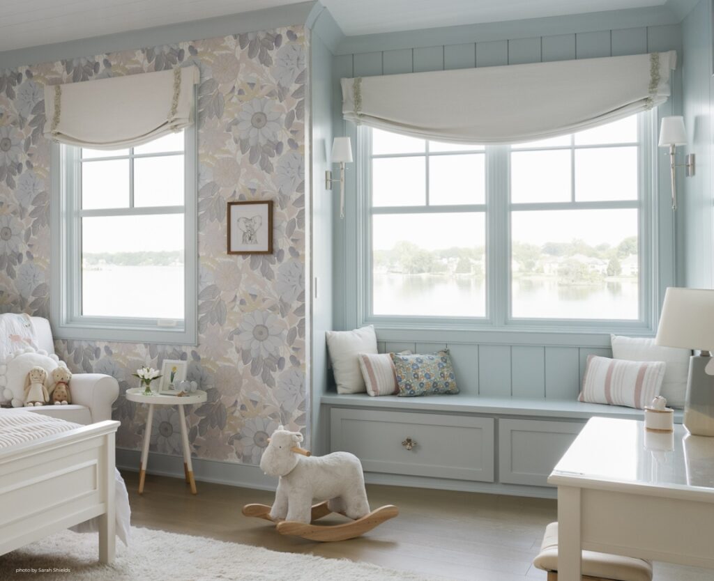
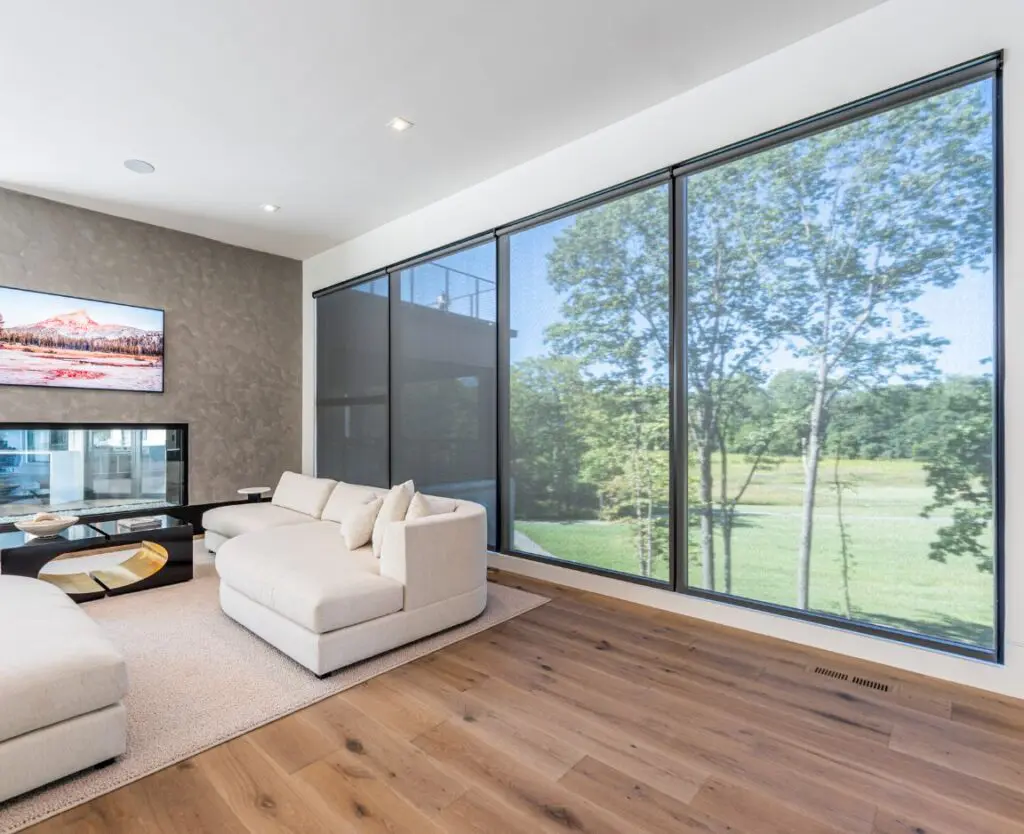
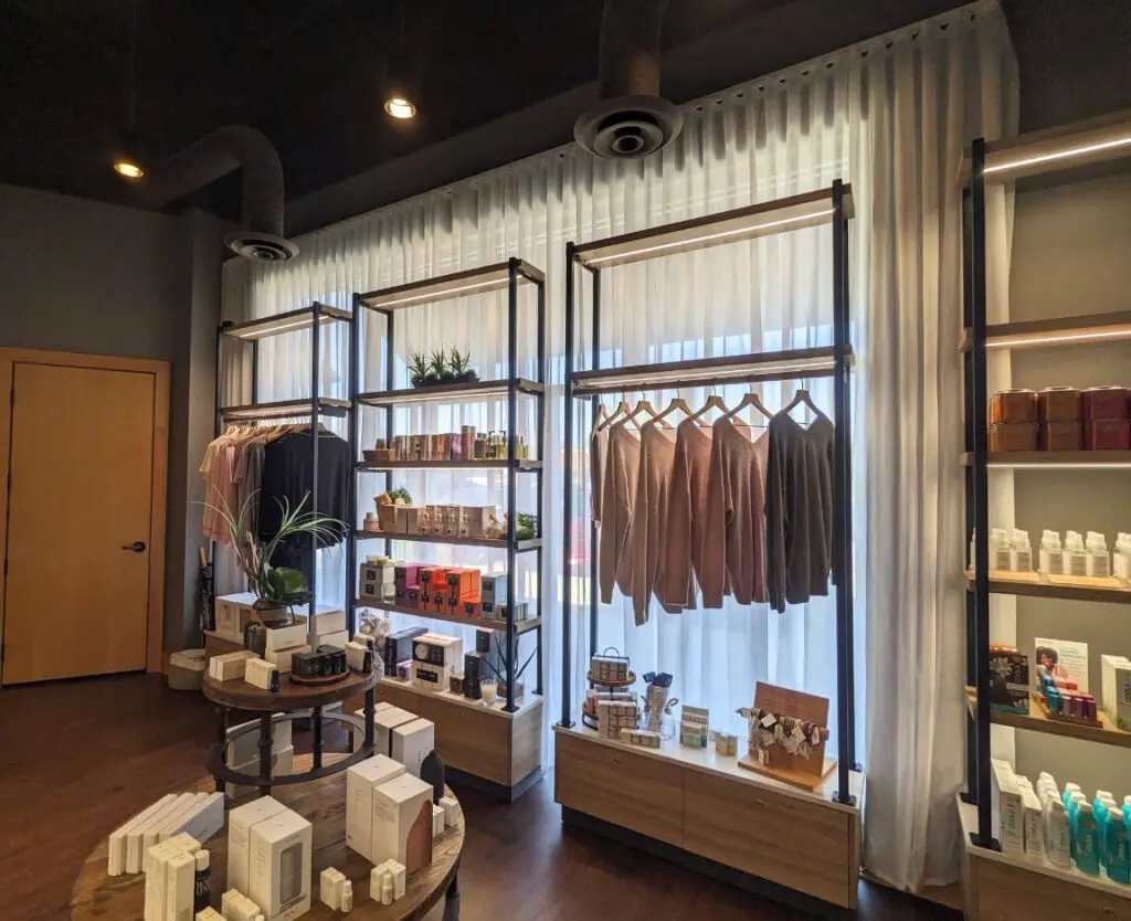
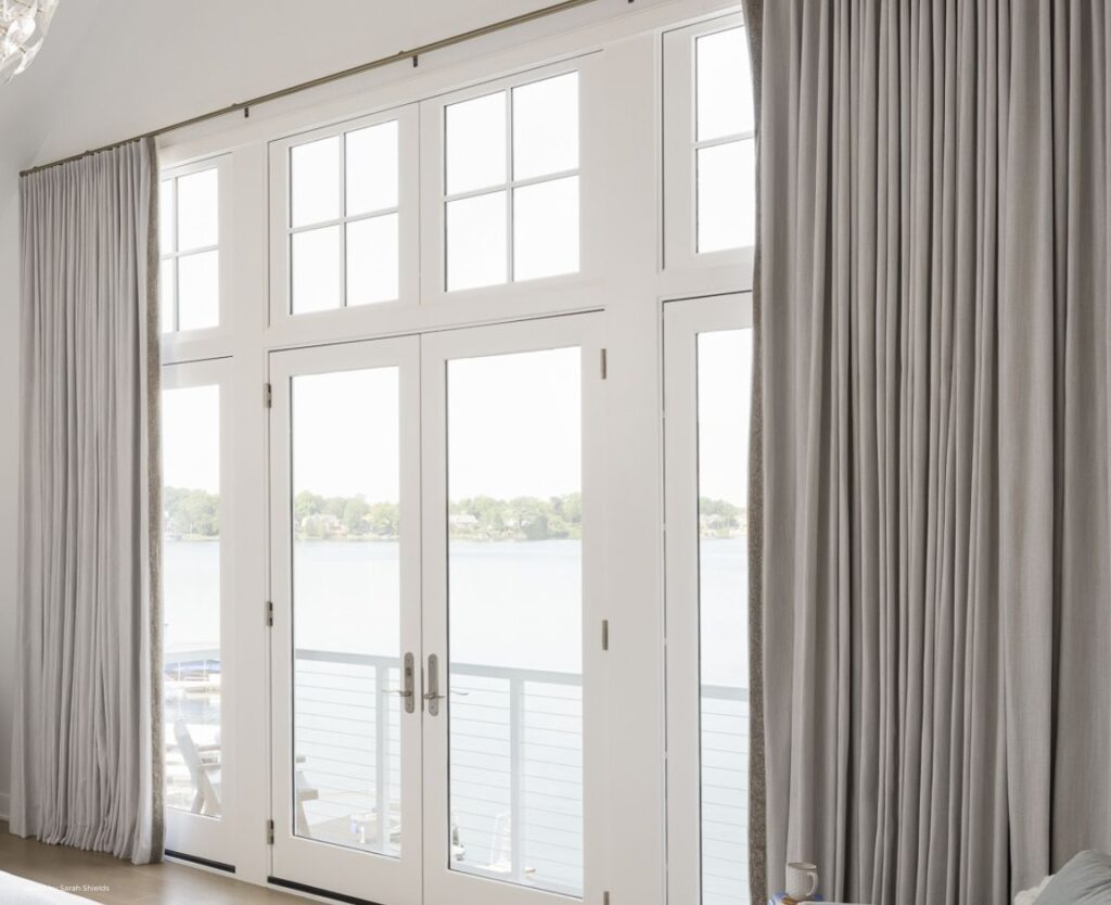
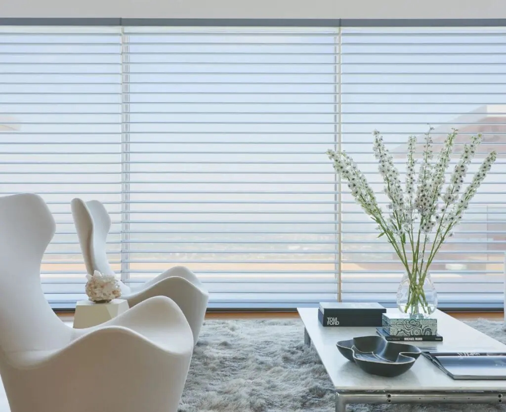
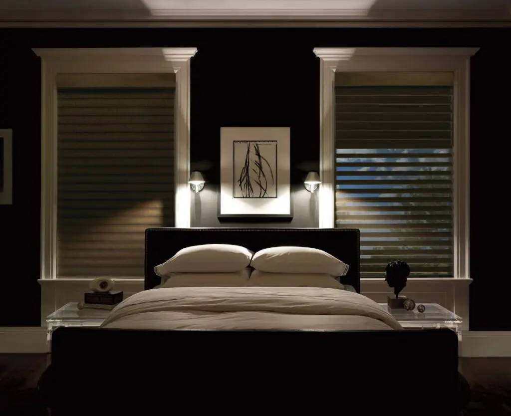
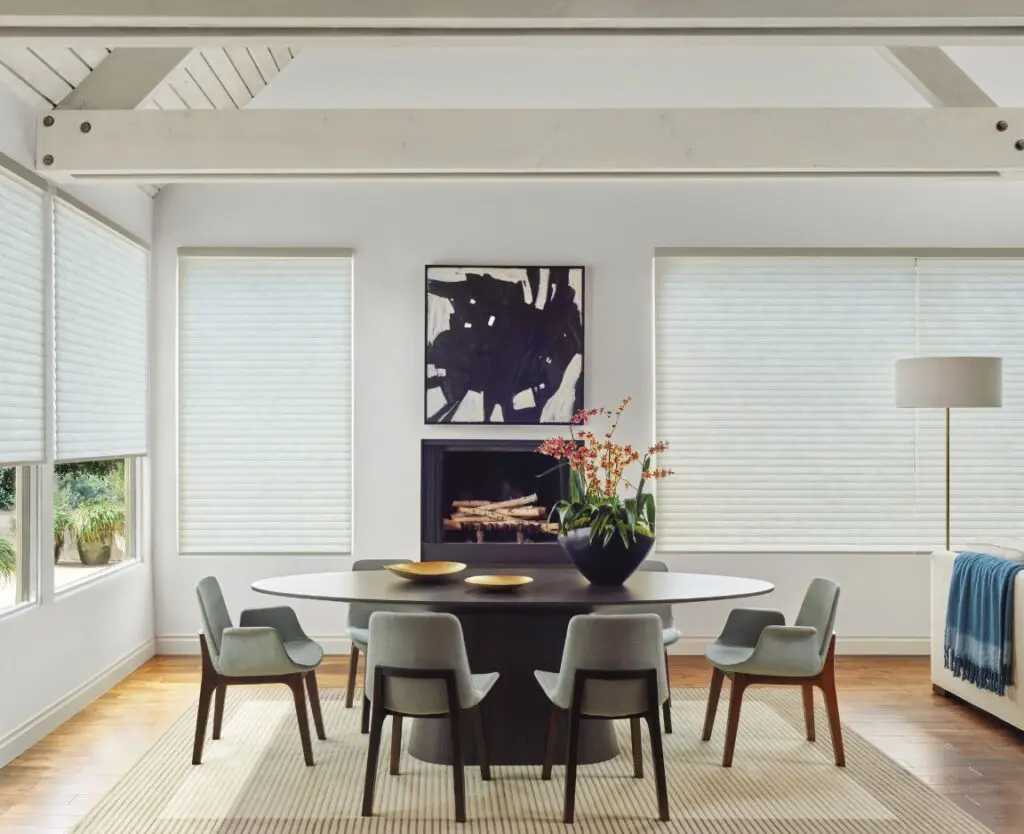
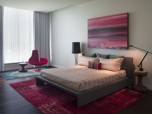
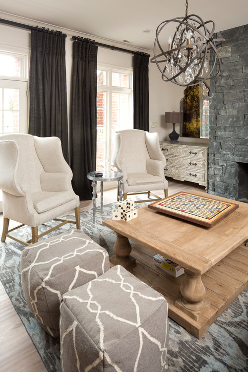
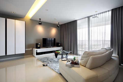
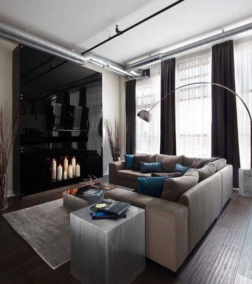
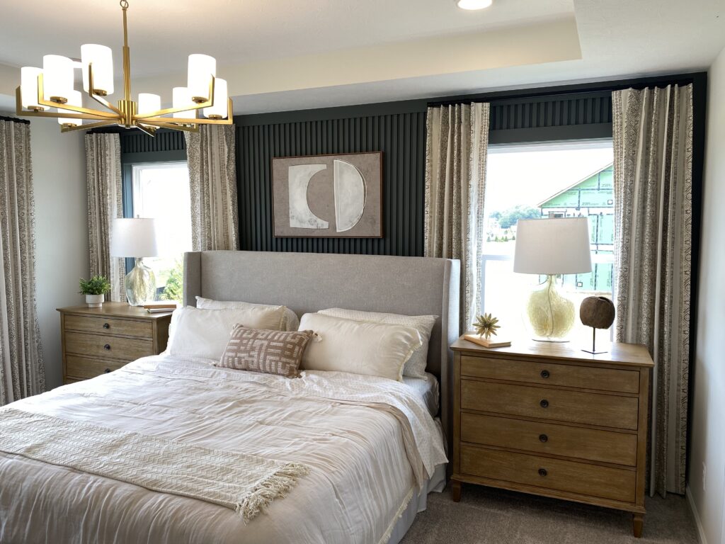
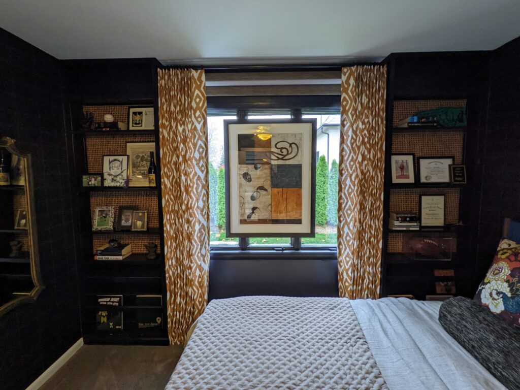
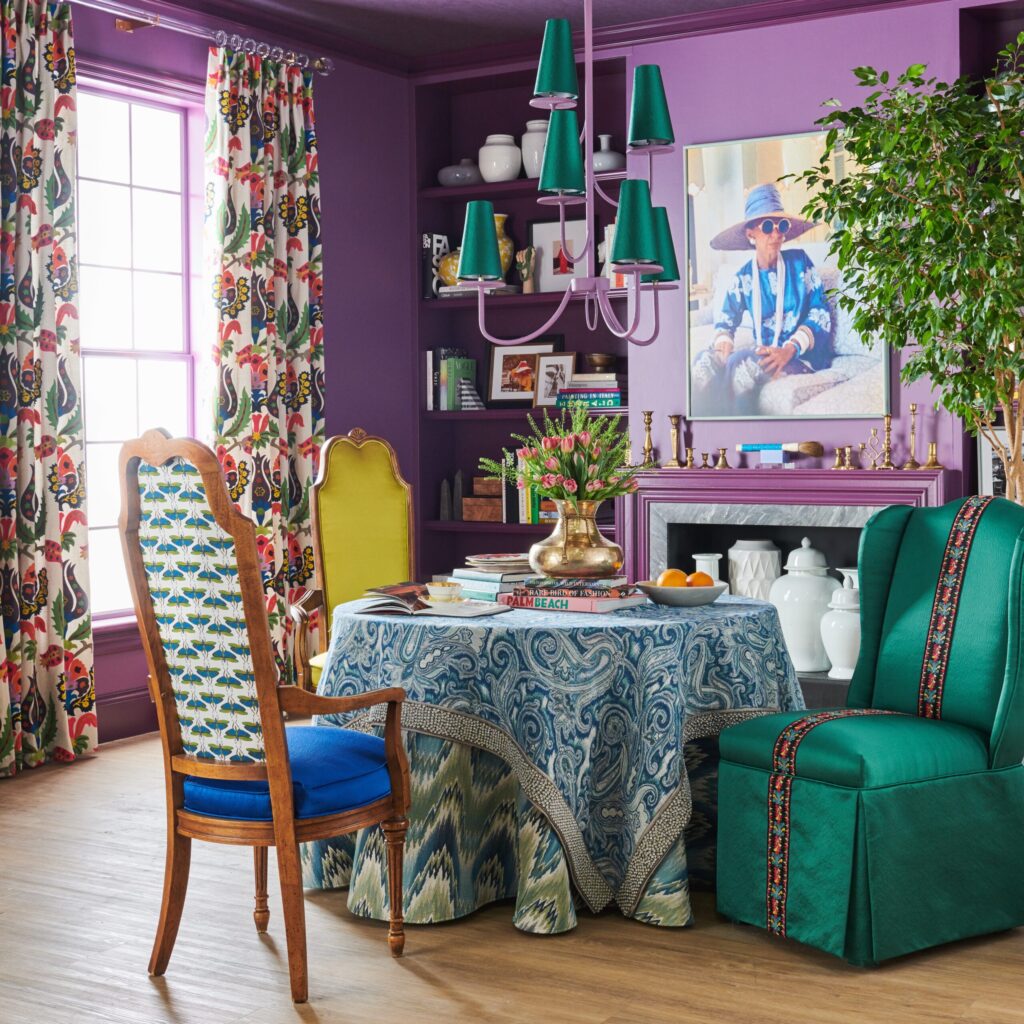
Here are some inspirational photos to show you how you can use variations of these colors in your home:
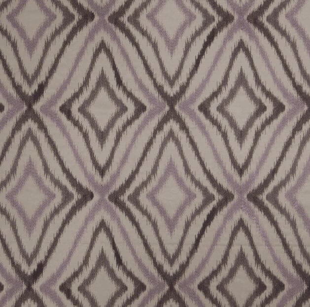 Fabricut Paolo Purple
