Drapery Street is thrilled to be part of Home-a-Rama 2016! This year’s Home-a-Rama showcases eleven stunning homes in the Chatham Hills neighborhood in Westfield, Indiana. Each of these homes have been custom-built by members of the Builders Association of Greater Indianapolis and feature the latest trends in design, technology, and landscaping.
Drapery Street has created custom window treatments for two 2016 Home-a-Rama homes. Today we’re touring the Gradison Design Build house. The Gradison team built a home that can accommodate every stage of a family’s life. It is comfortable and relaxed but features sophisticated elements. The interior of the home was designed by Lu Olp and Jessica Corbin-Mahaney of Kittle’s Design Studio.
Let’s get started on our tour of the Home-a-Rama 2016 Gradison Home!
Stop 1: The Living Room
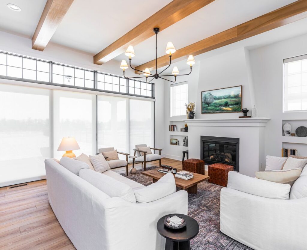
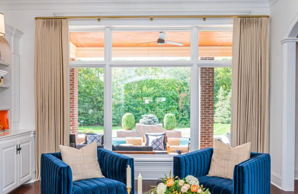
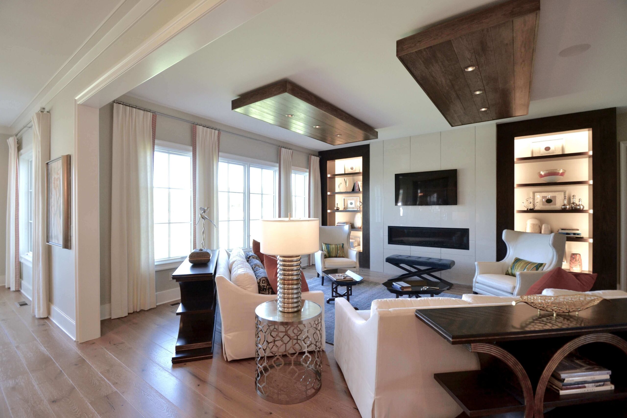
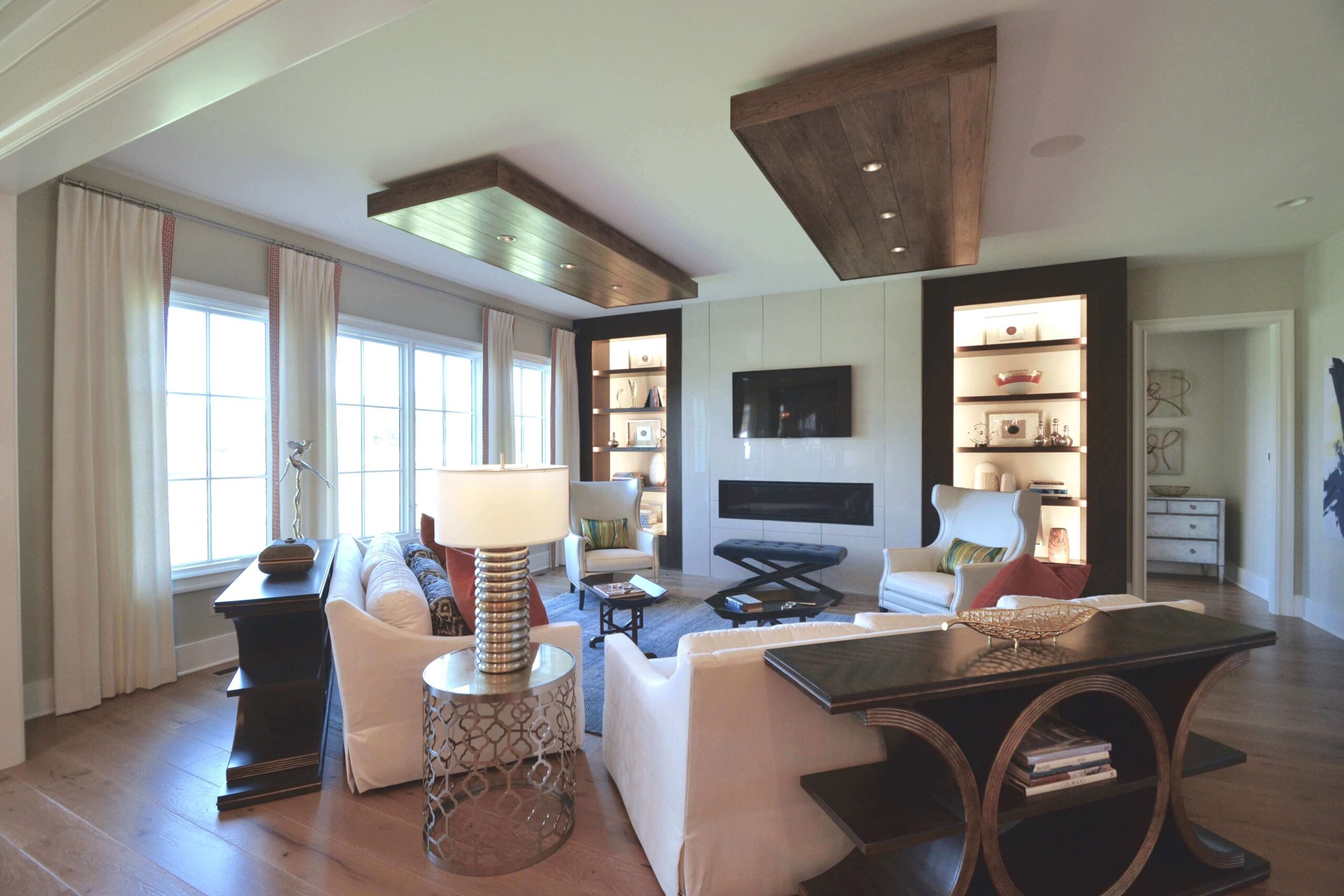
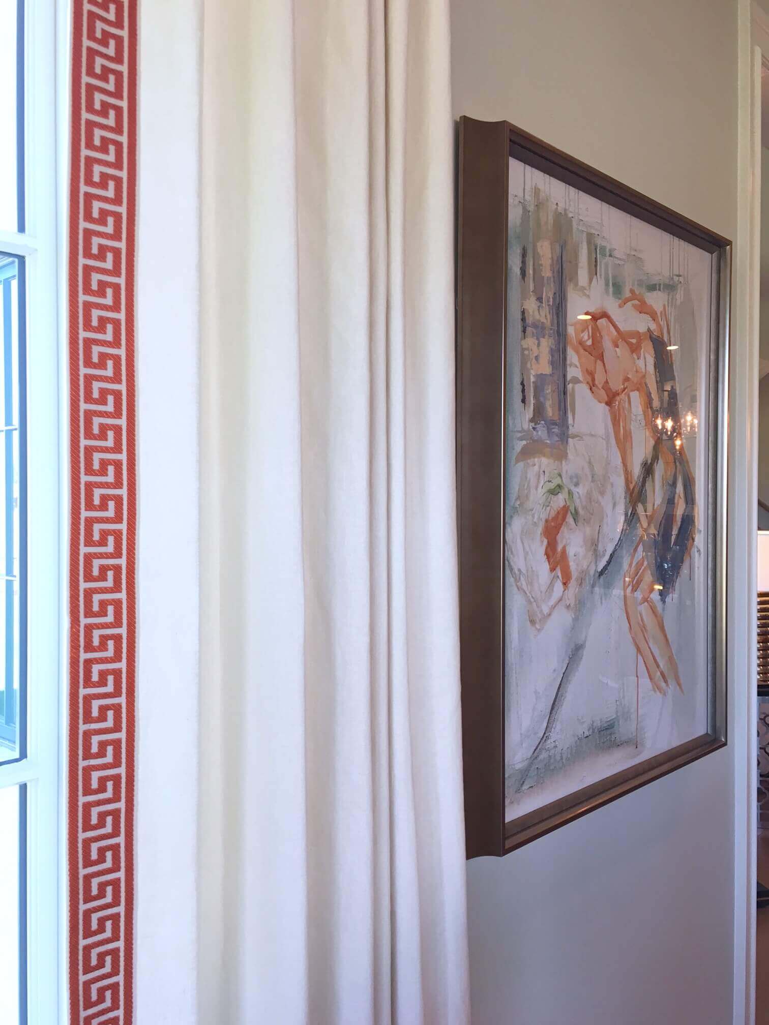
The living room of the Gradison home mixes neutral tones with pops of orange and blues and bits of green. Geometric shapes are plentiful. Notice the rectangular shapes of the custom light boxes, built-ins, and fireplace. These are balanced nicely by the circular tables and rounded vases. The custom window treatments add to the soothing feel of the room while playing with the geometric features. A neutral fabric was selected and then trimmed in an orange Greek key pattern. The drapery rod matches the brushed nickel elements that are found throughout the room. It is hung high and wide to add height to the windows and let in as much natural light as possible.
Stop 2: The Dining Room
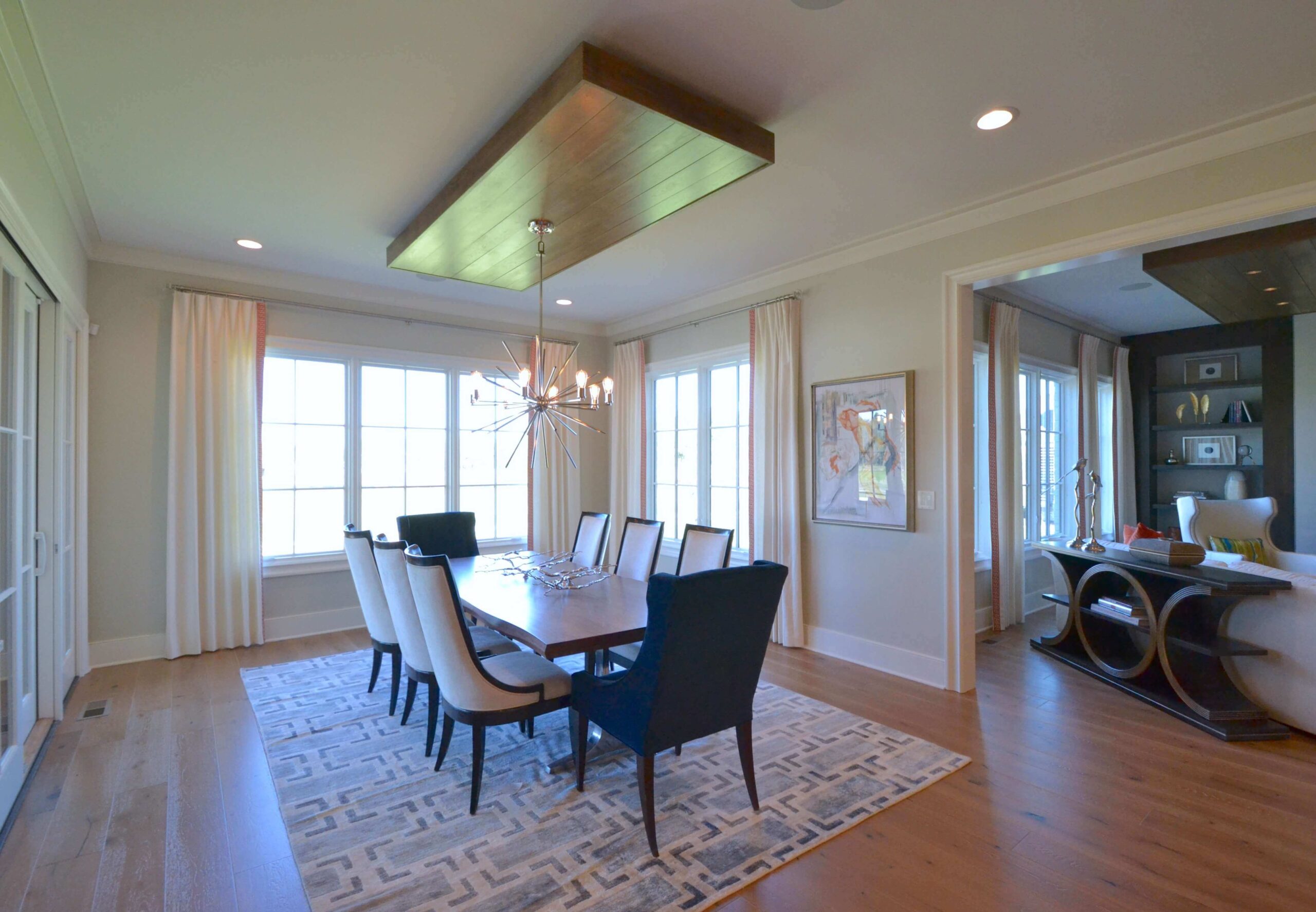
The living room opens up to the dining room and you’ll notice many of the same elements carry over. The rug adds an additional geometric pattern and more blue tones. Because these two rooms flow into each other, the same draperies found in the living room were continued in the dining room. This helps create a cohesive look between both spaces.
Stop 3: The Flex Room
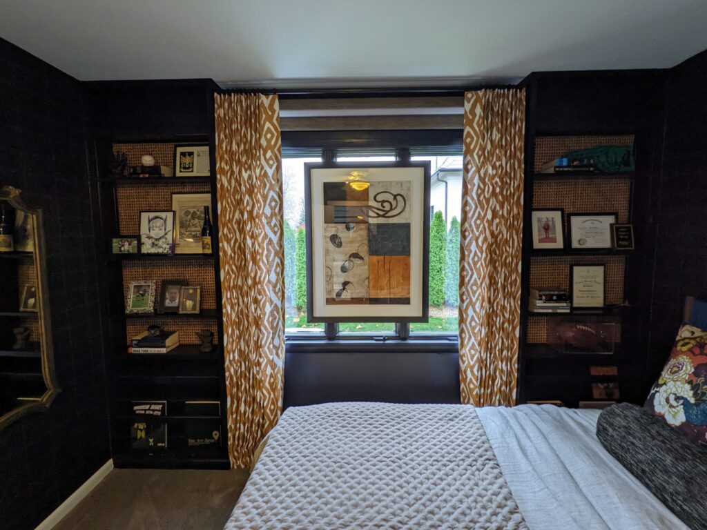
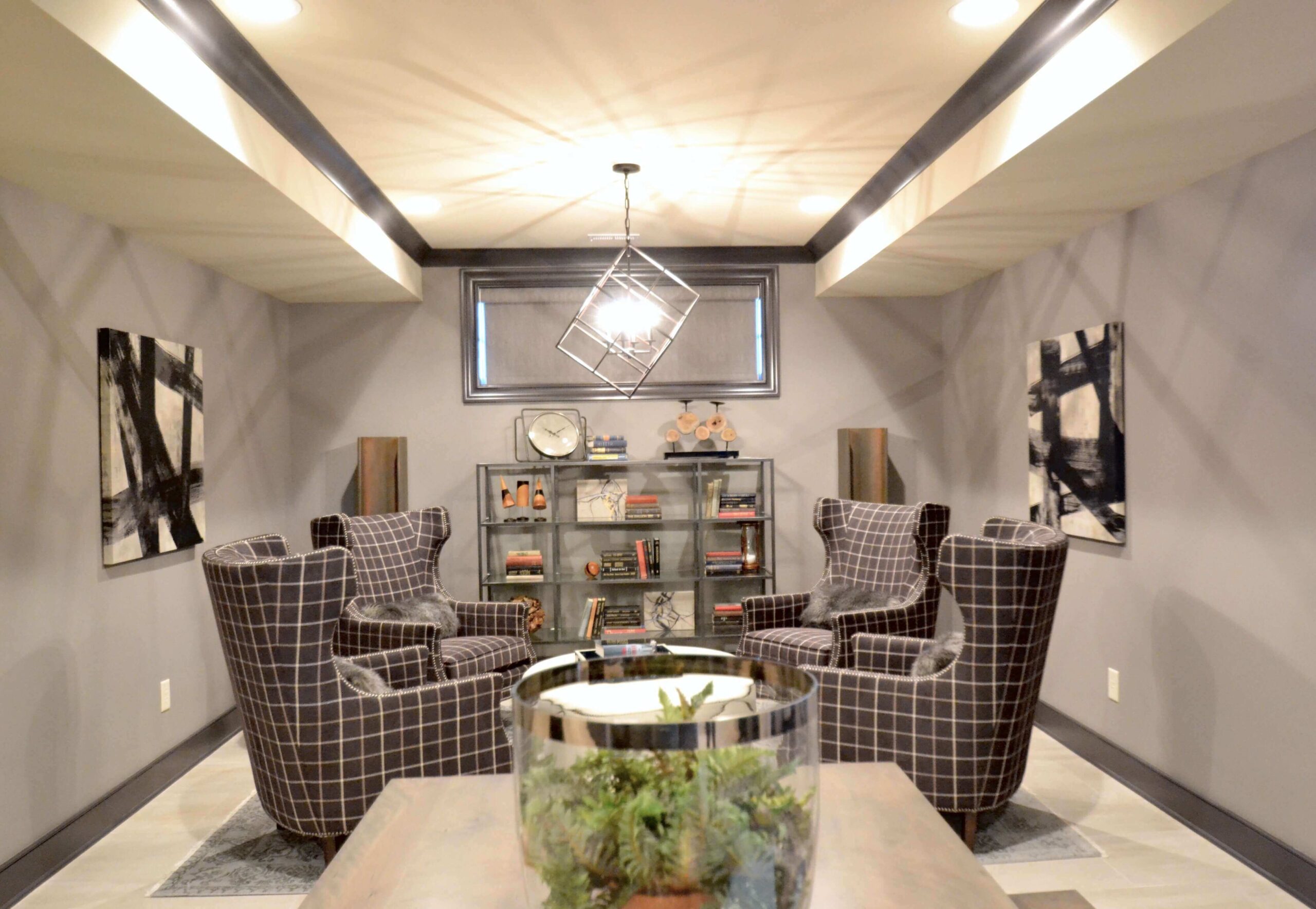
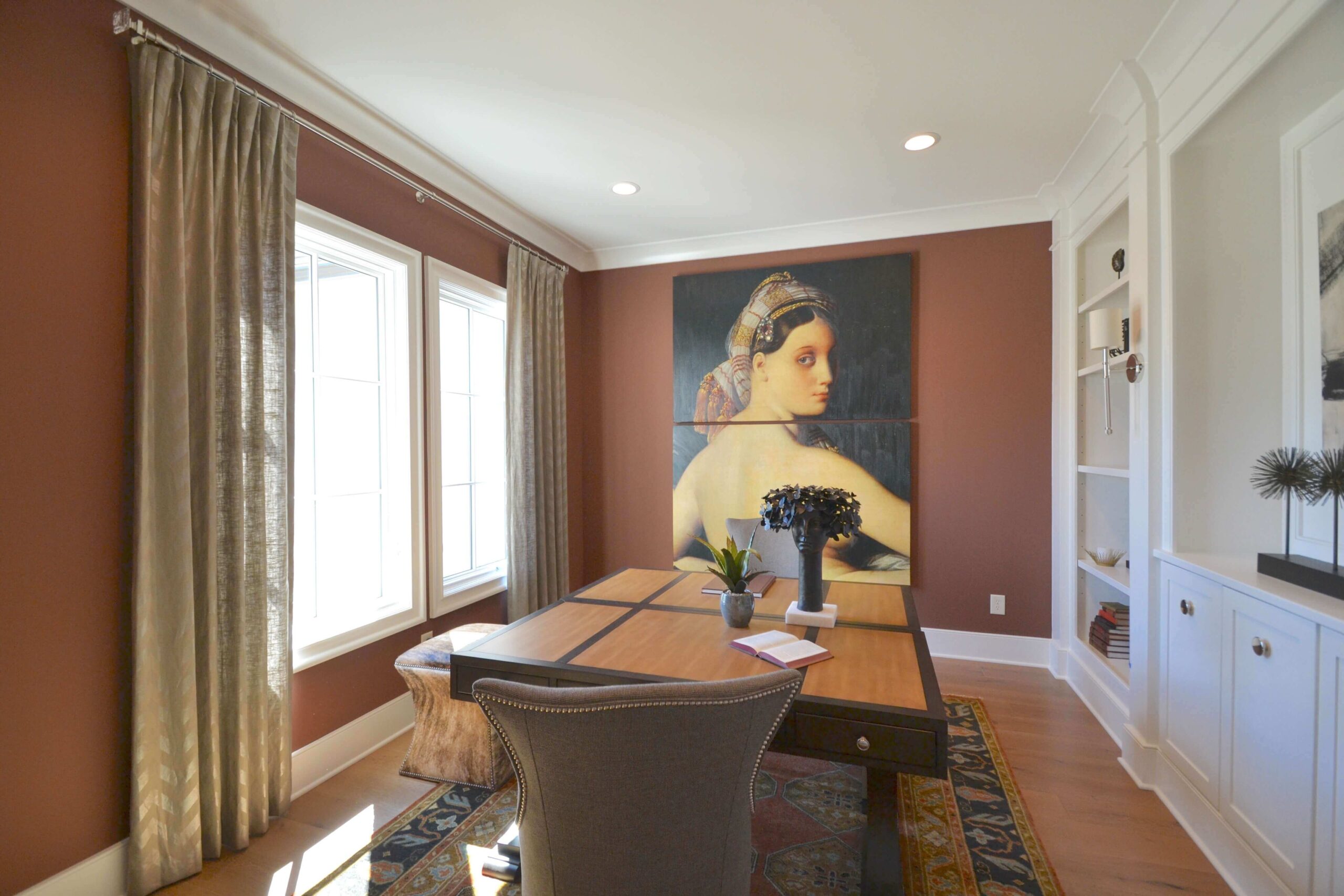
This room could be used in many different ways as a family grows and changes. We think it’d make a fabulous office! Because this room is located on the main floor, right off the entryway, the draperies needed to make a sophisticated statement as guests enter the home. Also, they needed to complement the dramatic artwork chosen for this space. A gold linen fabric with a faint chevron pattern was chosen. Notice the glass finials on the drapery rod. Great design is in the details!
Stop 4: The Master Bedroom
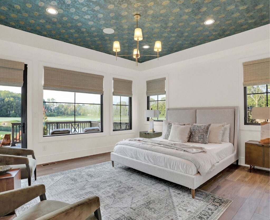
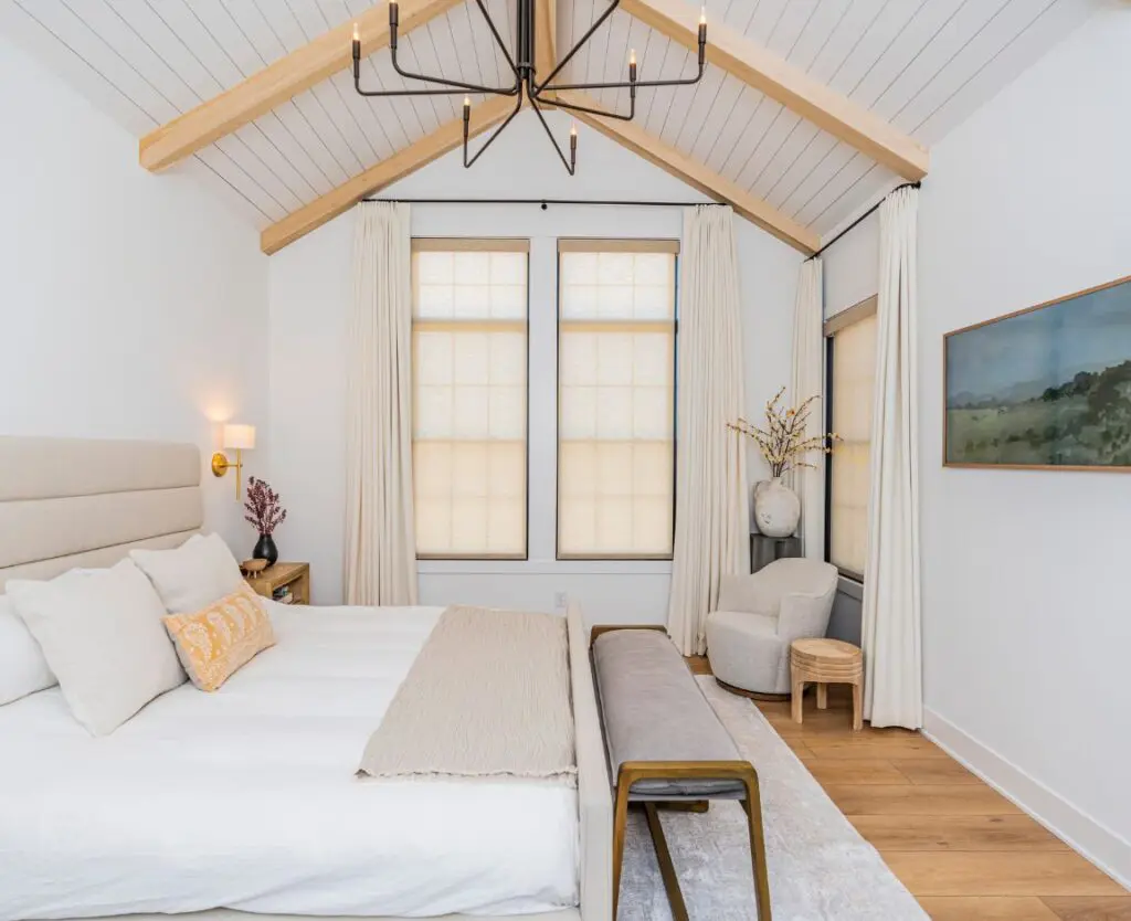
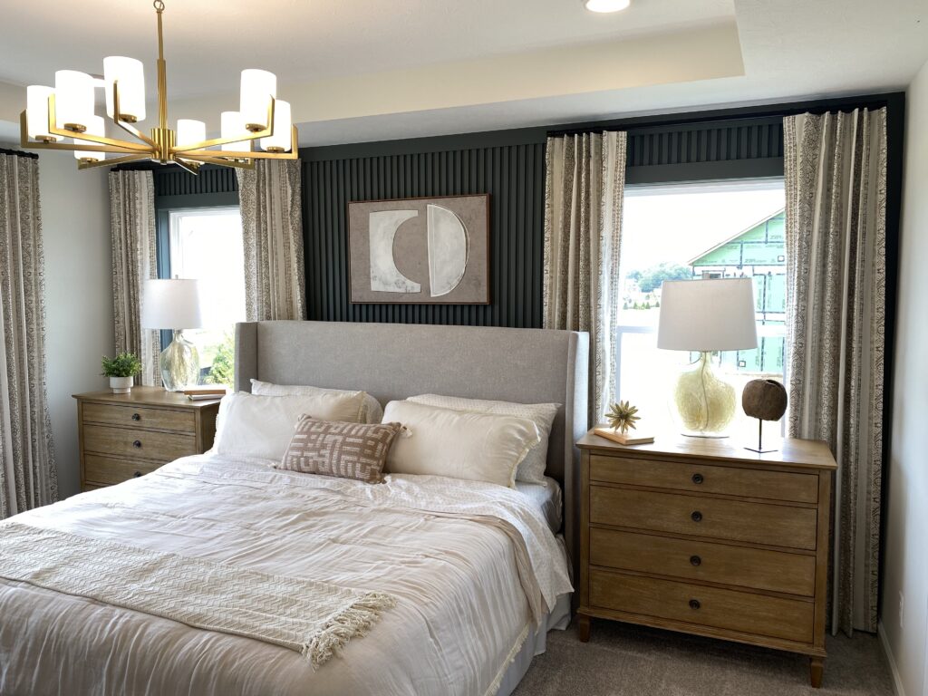
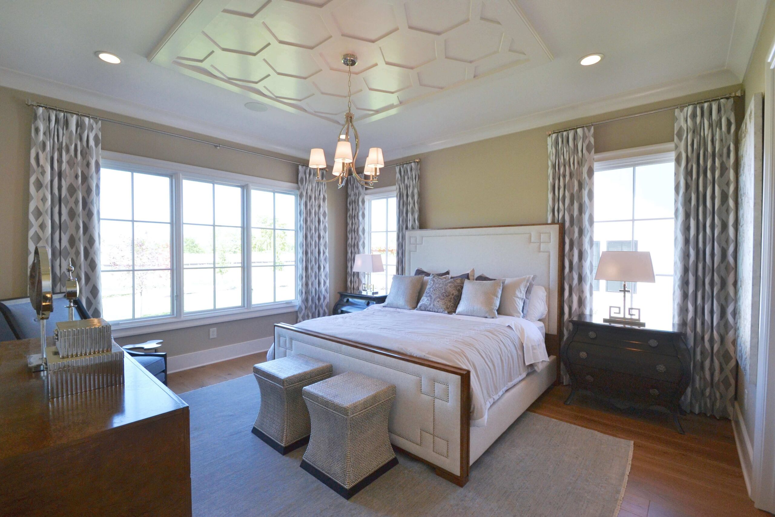
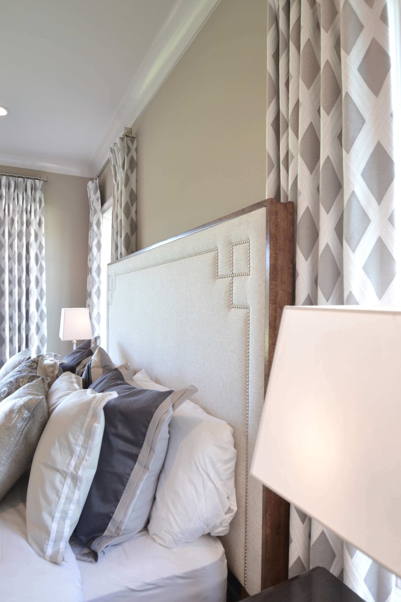
The main floor master bedroom is a relaxing retreat. Again, you’ll notice soothing neutral tones and geometric elements. The nailhead trim on the headboard and footboard is proof that small details make big impact. The window treatments pay homage to the beautiful ceiling treatment while adding depth and drama. Because there are few other patterns in this room, a patterned fabric for the drapes was a smart choice. To create these draperies, we took a patterned sheer fabric and lined it with a grey fabric. The sheer fabric adds softness while the grey lining brings the drama. How perfect for a sophisticated master bedroom!
Stop 5: Girl’s Bedroom
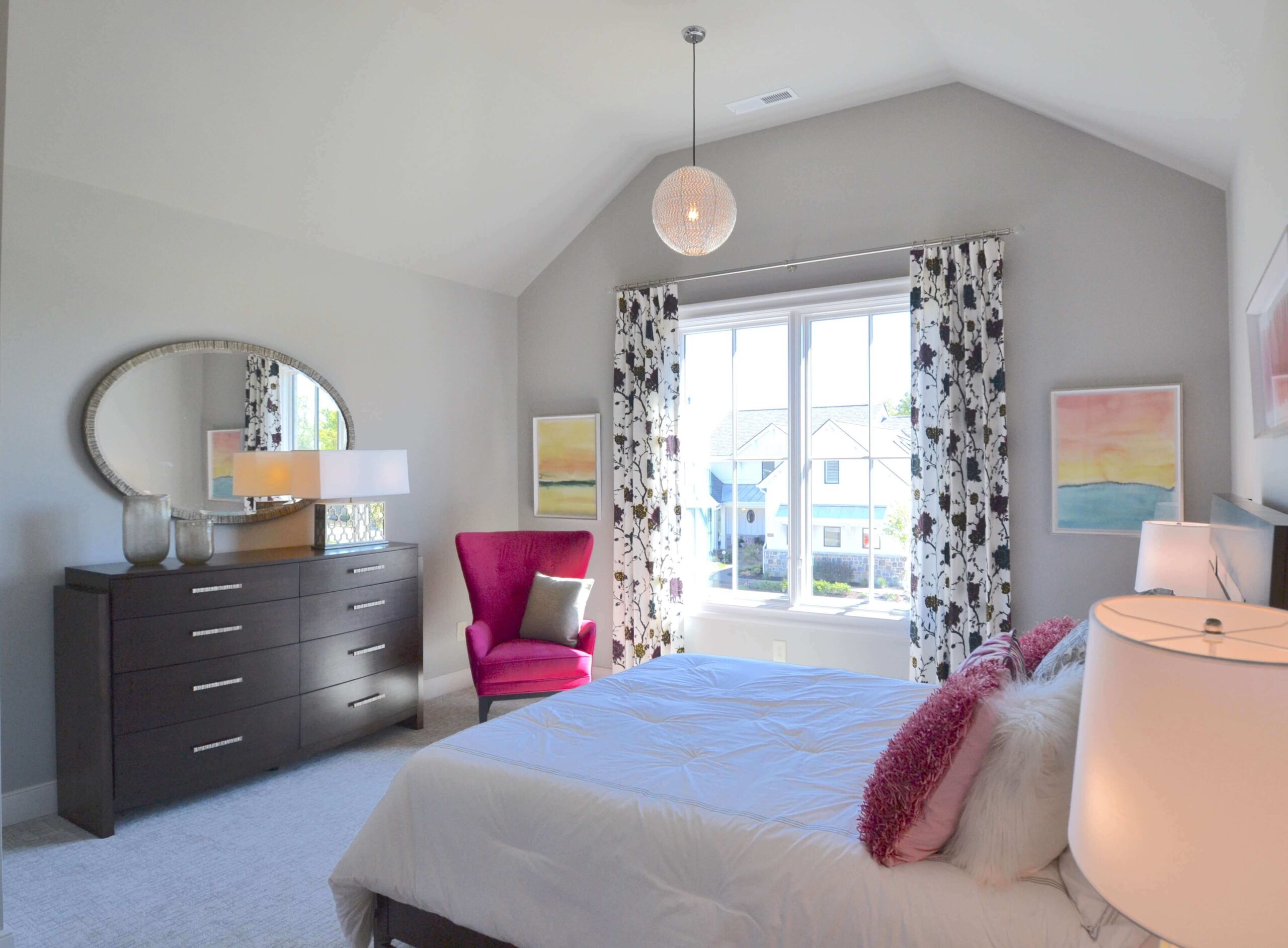
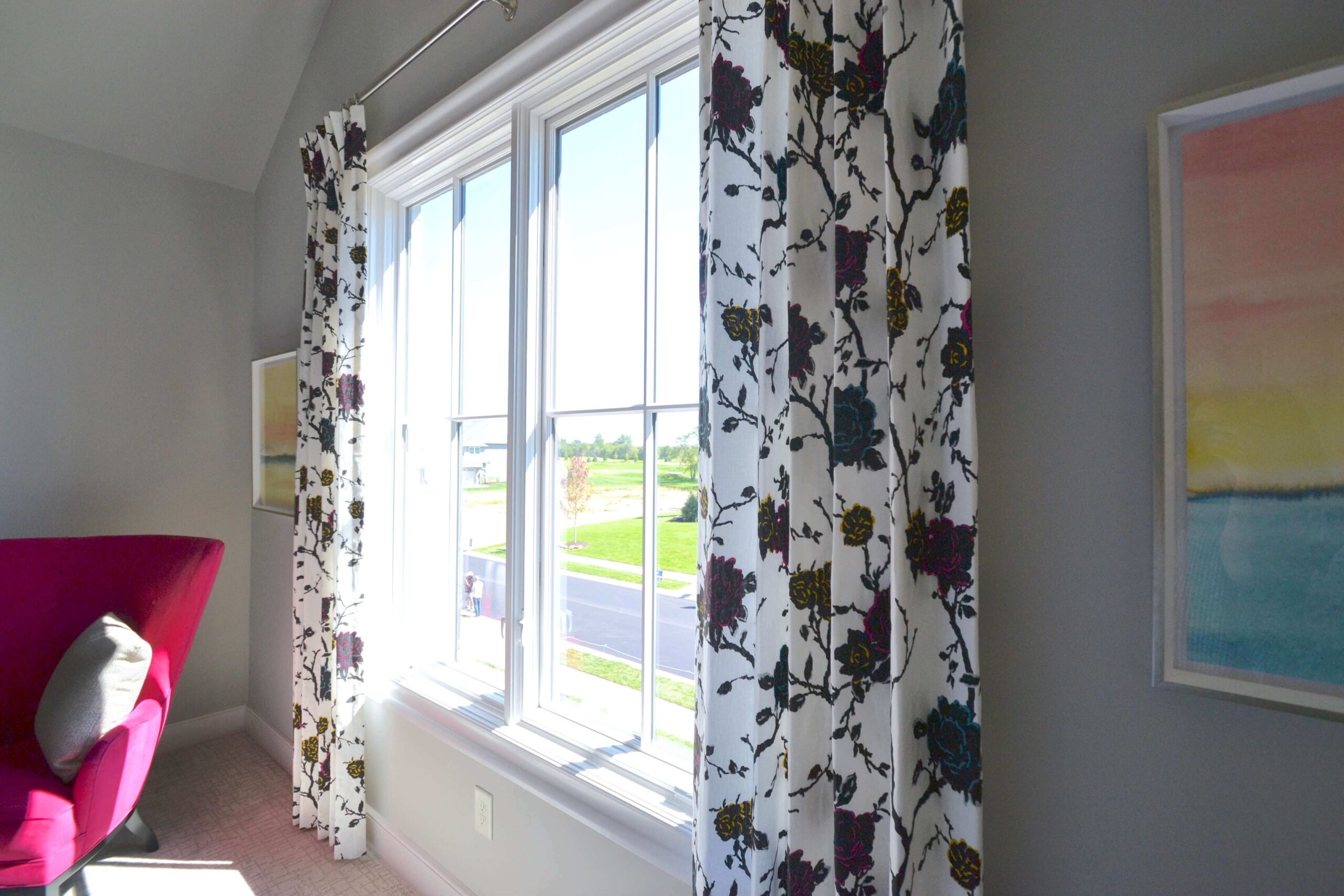
This bedroom is a teenage girl’s dream! It is sophisticated but full of fun, sassy surprises! While the walls and bedding are neutral, pops of hot pink give the room plenty of color. At first glance, the drapes may look like a black and white floral pattern. Look again and you’ll notice that the flowers are highlighted in blues, pinks, and yellows. If the room’s owner ever wants to change out the hot pink accents with another color, these drapes are versatile enough to undergo the transition.
Stop 6: Second Girl’s Bedroom
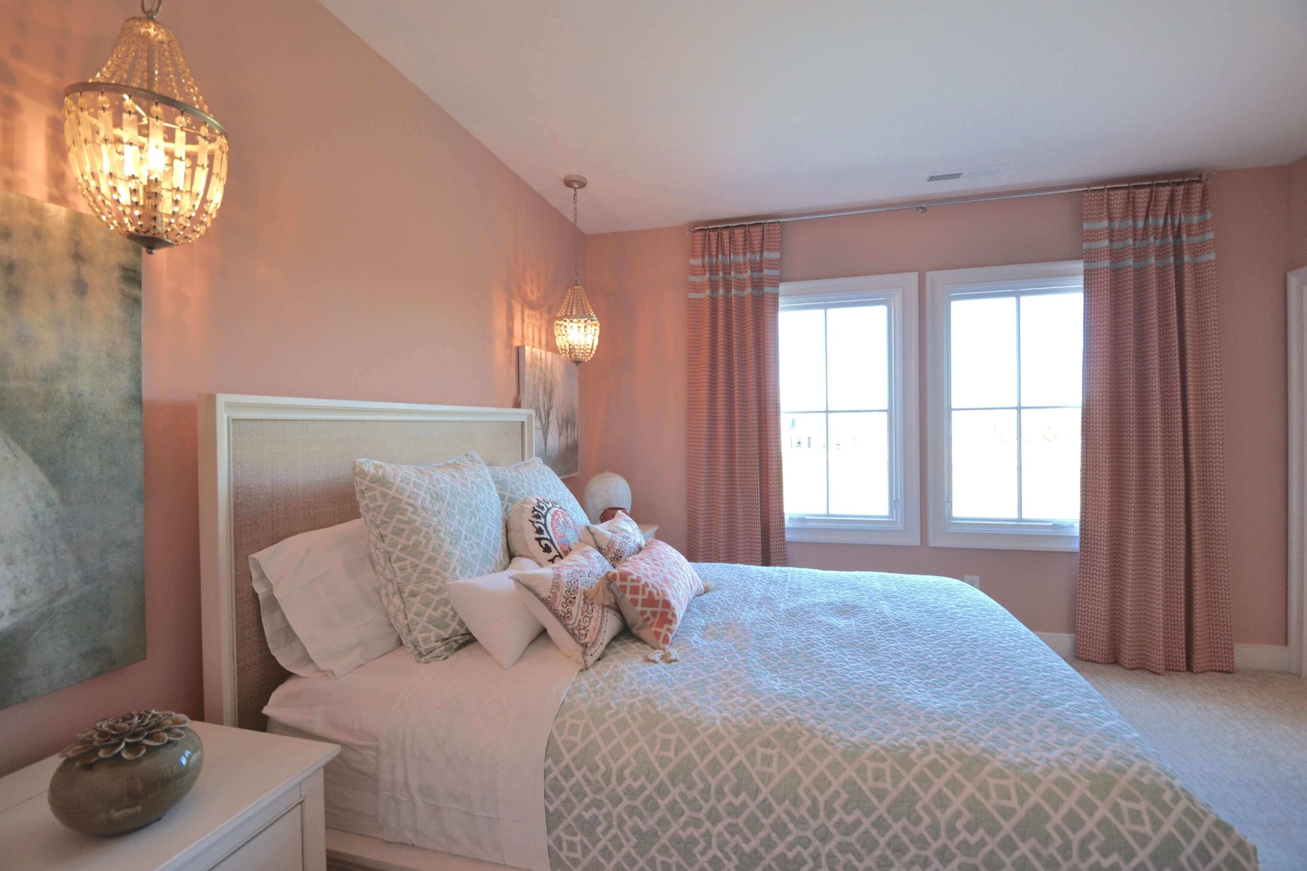
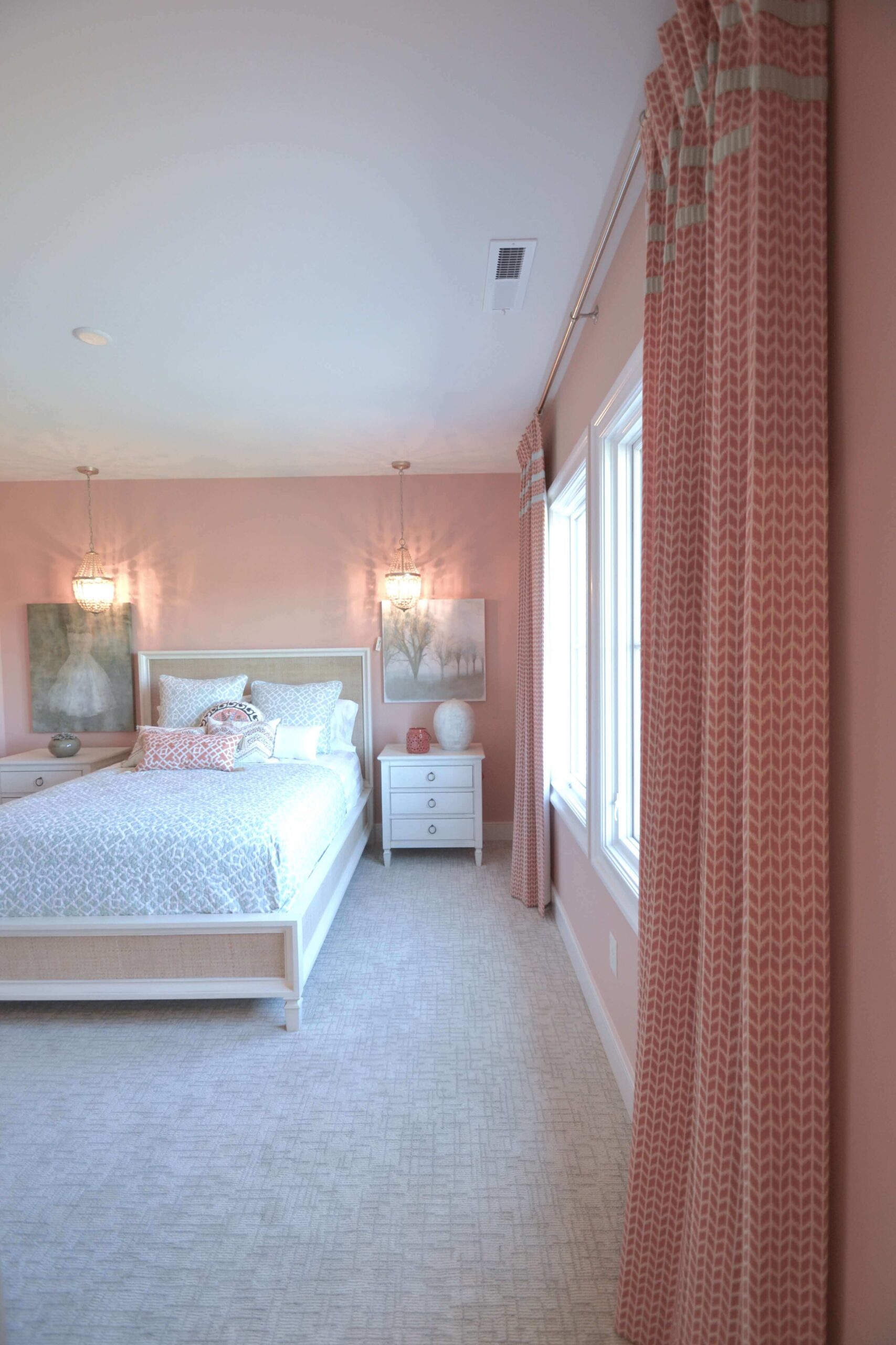
This room is all about femininity and is a great example of tonal design. Rather than choosing a complementary color, the soft pink found on the walls were also chosen for the draperies. To make the design successful, a fabric was chosen in a darker shade with a subtle pattern and banding. A solid color in the same shade would have blended into the wall too much. If you try tonal design at your home, be sure to embrace texture and vary the intensity of the hues.
Stop 7: Boy’s Bedroom
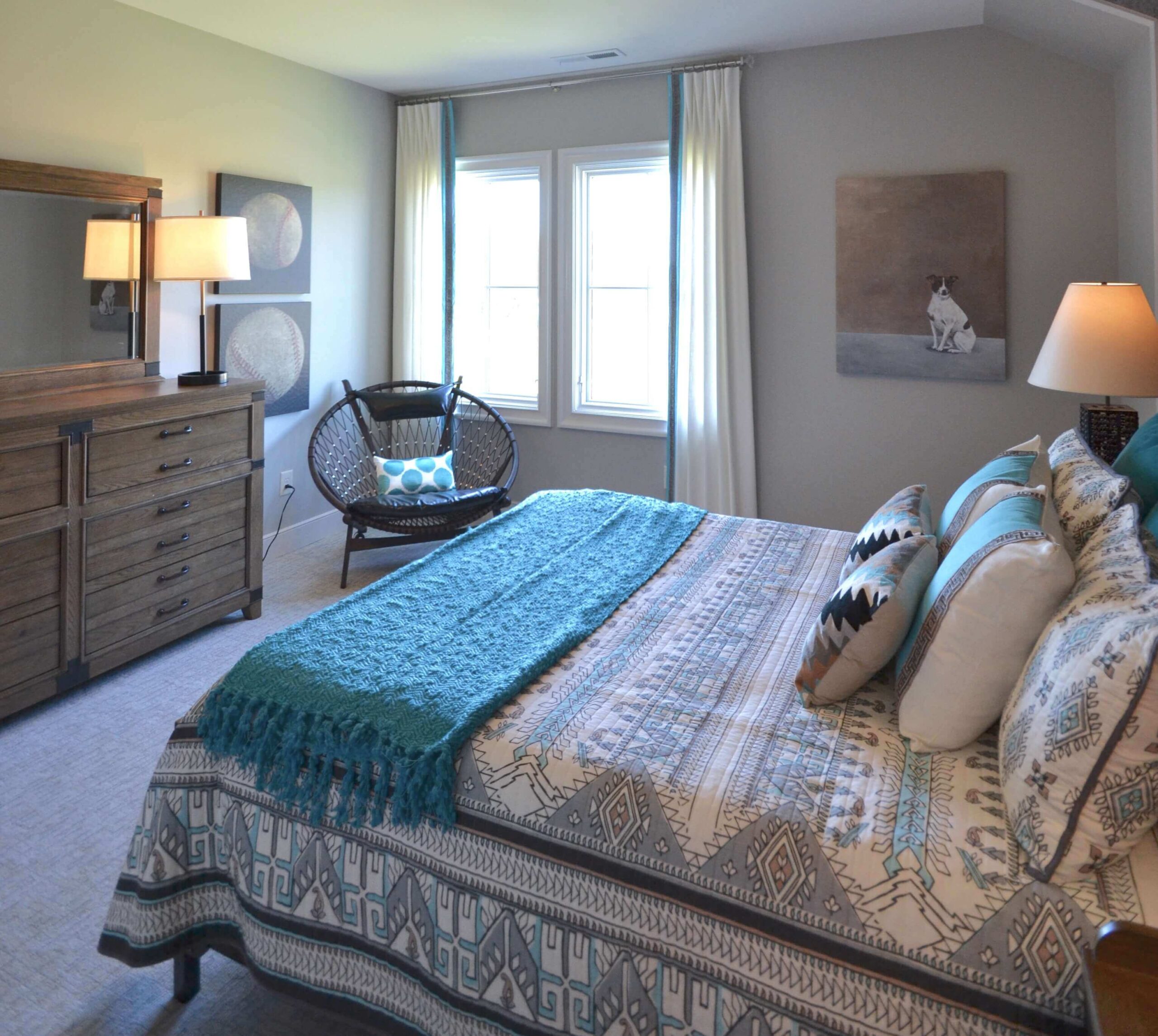
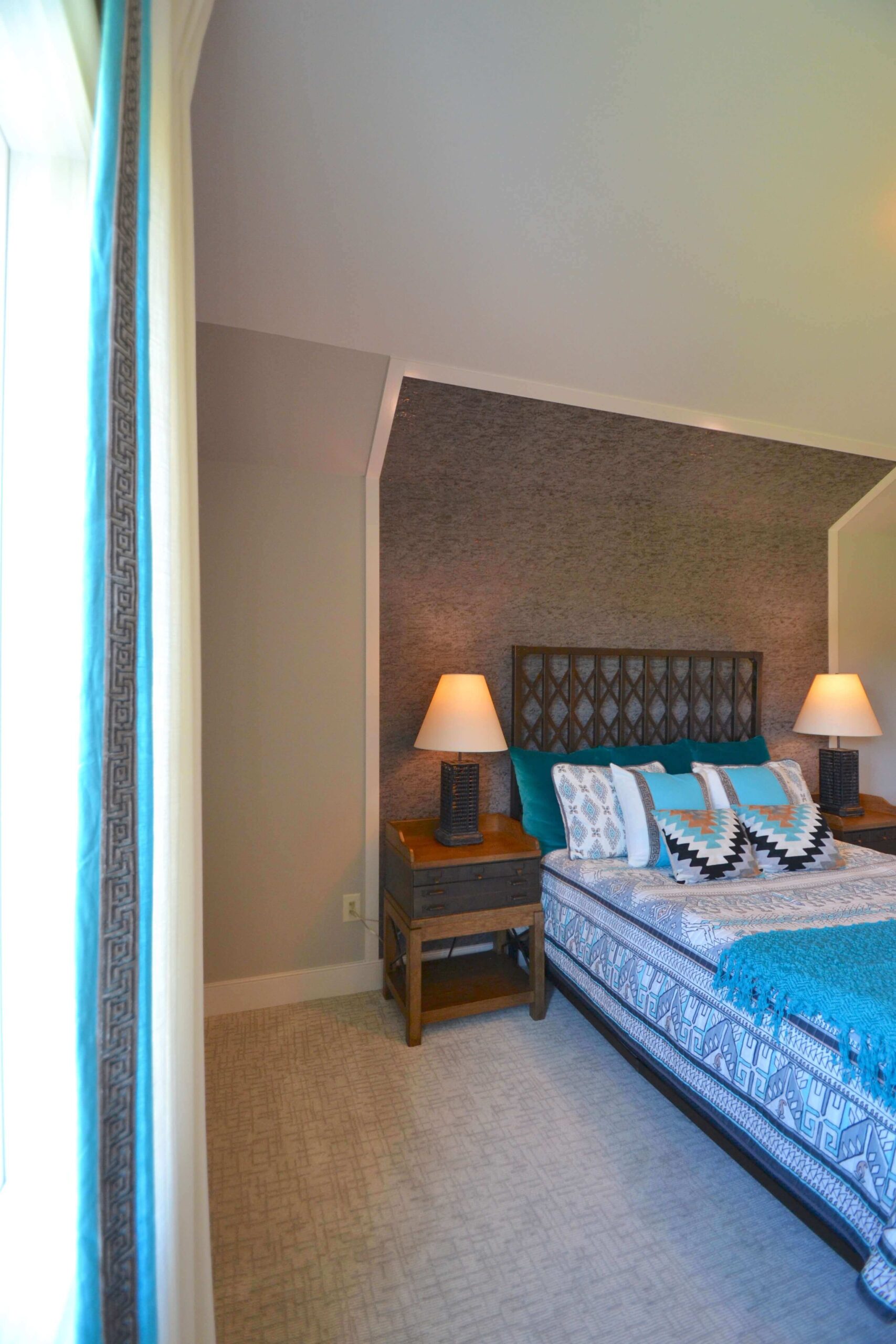
We love this bedroom because it is so versatile and can change with the age of the child. The furniture, draperies, and wall treatment are timeless and can be styled in a variety of ways. The draperies are a neutral white with Greek key banding trimmed in blue. You’ll notice this pattern again on the throw pillows. Did you see that wall treatment behind the bed?! Amazing!
Stop 8: Guest Bedroom
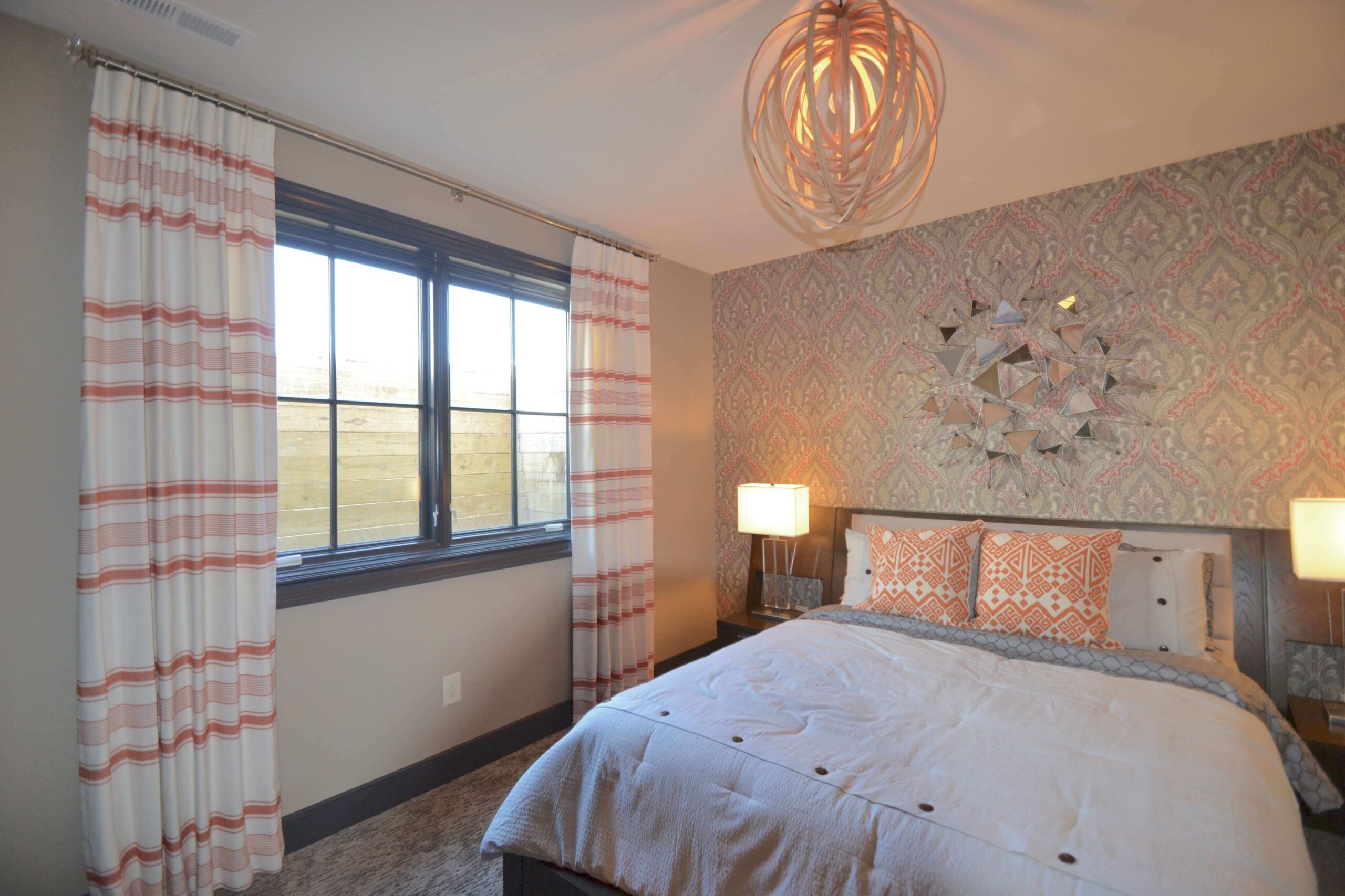
The guest bedroom in this house is located on the lower level, but you’d never know it by all the light! This was achieved by choosing light greys and vibrant oranges as the main color palette. Mirrors and plenty of lighting fixtures also contribute to the light in the room. This room is a great example of how to mix patterns. The trick to successfully mixing patterns is to choose different kinds of patterns in various sizes—and include a few solids too. Horizontal striped drapes are a striking choice next to that stunning damask wallpaper!
Thanks for touring the 2016 Home-a-Rama Gradison Design Build home with us! To truly understand how beautiful this house is, you must tour it in person and immerse yourself in its design and craftsmanship. The 2016 Home-a-Rama in Chatham Hills is going on now until October 2nd. Get more information and purchase tickets here.
Did you see a window treatment look you’d love to steal for your house? No problem! We can create a similar look for your space. Get started with a free design consultation.

